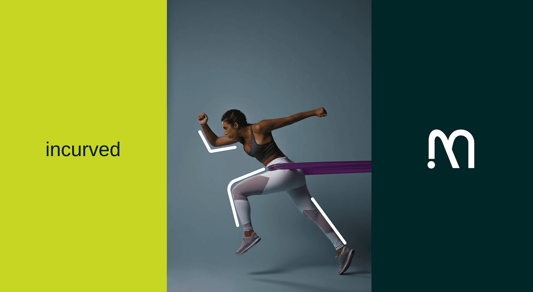
MANZER logo design
MANZER is a modern gym brand aiming to inspire strength, resilience, and peak performance. The logo design was created to embody energy, discipline, and determination, blending a bold, athletic style with a clean, memorable mark. It’s a visual identity that works seamlessly across merchandise, signage, and digital platforms.

Discovery phase
The process began with understanding MANZER’s mission, target audience, and brand personality. I researched the fitness industry’s visual trends, studied competitor identities, and identified ways to make MANZER stand out. The goal was to create a logo that communicates strength and movement while remaining versatile and timeless.
By conducting user surveys and casual conversations, I uncovered genuine pain points, goals, and expectations. These real-world insights became the foundation for shaping a solution that truly resonates with users.
Ideation Development
I explored multiple logo concepts through sketches and digital drafts, focusing on bold typography and dynamic shapes that convey motion. The “M” symbol was refined to be both recognizable and adaptable, allowing for strong standalone branding. Color psychology was considered to ensure the design would resonate with the gym’s energetic and motivational environment.
Graphics design
Branding

Visual Exploration
I experimented with modern sans-serif typography, angular forms, and a color palette that combines vitality and professionalism. The final design uses a vibrant green accent to symbolize growth and energy, paired with strong black and white contrasts for impact. The design ensures visibility and readability across different sizes and mediums.
Brand Application
The logo was applied to various brand assets, including gym apparel, equipment, social media graphics, and promotional materials. Its clean yet dynamic form ensures consistency while reinforcing MANZER’s identity as a place of focus, progress, and personal transformation.